Here is an example of projection maps from the website based on the SRES A2 emission scenario:

Regional projections of temperature change under the A2 emission scenario are given in AR4:

http://www.ipcc.ch/publications_and_data/ar4/wg1/en/figure-11-11.html
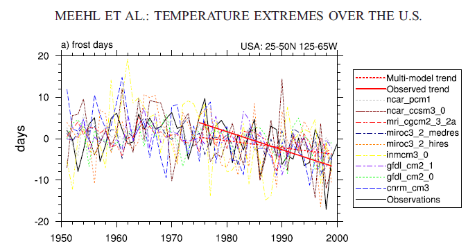
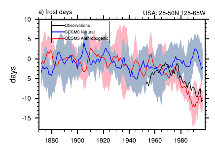
Of some relevance to the article on the ClimteCentral.org website is a 2007 study by Meehl, Arblaster and Tebaldi, which finds that the number of frost days (number of days in a year when the temperature goes below freezing) in the US has decreased in recent decades and they attribute these changes as largely anthropogenic:
I haven't read the rest of the ClimteCentral.org website, it was drawn to my attention only because I saw Steve Goddard had attacked this particular article on WUWT, in a post on WUWT which concludes:
Based on the NCDC data, there is no evidence that increases in CO2 over the last 30 years have affected March temperatures in the north central region of the USA or moved the freeze line north. Once again, we see a case of scientists trusting climate models ahead of reality.
Goddard's conclusion (if true) would be specific to the ClimteCentral.org article rather than the peer reviewed literature on the subject (eg Meehl 2007), so offtarget of true relevance.
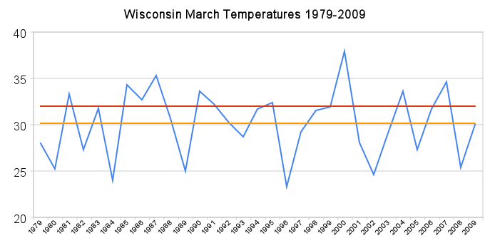
Steve Goddard describes the ClimateCentral.org article as "March Model Madness" and cites the following graph of mean temperatures of Winconsin Marchs since 1979:
He explains:
The orange line is the mean and the red line is the freezing line. Note that not only is there no trend towards a warmer March, but the standard deviation is high (3.67) and the range is also large – about 15 degrees difference between the warmest and coldest March.
Already I am thinking the ClimteCentral.org article covers a lot more area than Wisconsin (and the other state Goddard later looks at), so can Goddard's post really have much relevance to the ClimteCentral.org article? For the sake of argument I will just assume it can.
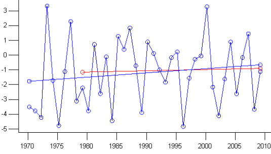
He asks us to note that there is no trend towards a warmer March, but how can we note that when he hasn't provided us a figure for it? The mean line, as far as I can tell, is literally the mean over the 31 year period (1979-2009). I plotted the same range of March mean data for Wisconsin from the (Wisconsin State Climatology Office) and also added a line of best fit:
Here's the same graph in Celsius:
There is a slight warming trend, it works out as about 0.08C/decade. I doubt it's statistically significant, but extrapolating that increase would put mean Wisconsin becoming about 0.7C warmer by 2090. The average March temperature of Wisconsin over the period 1970-2009 is about -1C.
Goddard justifies the start point in 1979 by saying
The reason to use 1979 onwards is because Hansen reports his trends from 1979 onwards. CO2 has increased quickly since about then, and that is also when satellite data came on line. 1979 is the year when GISS data turned sharply upwards, so it is a conservative time period to argue the thesis.
Goddard's words here are the real March Madness. What has Hansen got to do with this? Since when to skeptics copy what Hansen does? When Goddard says "the year when GISS data turned sharply upwards" Goddard refers to and shows the GISTEMP global-land temperature index. But what relevance does that have to Wisconsin? If such an "upturn" method made sense (it doesn't), wouldn't it make more sense to take the year when Wisconsin data turns sharply upwards?
As for co2 increasing quickly, what's special about 1979 that distinguishes it from 1970 or 1985? What's special about the year the satellite records start? None of this has any relevance to Wisconsin temperatures and none of this explains the start point of 1979 as anything other than arbitrary.
Could it be that this long nonsensical ramble of a justicication might indicate Goddard knew something more that he let on - that the choice of start-point makes a big difference to the result? Could he be merely constructing an odd justification for the choice of 1979 in case anyone checks?
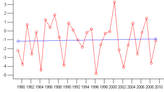
I plotted the data from 1970:
The red line shows the best fit line from the previous 1979- graph. From 1970 there is a larger slope, 0.28C/decade. At that rate March in Wisconsin would be on average about 2.5C warmer by 2090. The average temperature of March in Wisconsin over the period 1970-2009 is about -1.1C. So the projection to 2090 using the start date of 1970 puts the average March temperature of Wisconsin easily above zero by 2090 (not that this is completely relevant to the climatecentral.org article anyway). These results are very different than if you start in 1979, so the whole method is likely a waste of time.
Imagine that an "alarmist" had chosen a start point with a long and weird excuse and then a skeptic had subsequently found that pushing that startpoint back a mere nine years revealed a very different result. We wouldn't hear the end of it!
A more obvious issue is that the climatecentral.org article is about the future. Nowhere do they state or imply that this started on the order of 30 years ago and the trend should be visible in Wisconsin already. It may well be more complicated than that. Goddard has simply pulled this strawman out of his ass.
ReplyDeleteOnce again, we see a case of Goddard trusting his bowels ahead of basic reading comprehension.
Moreover, Tamino has shown that 1975, not 1979 is the natural turning for GISS as a whole. This is not cherrypicked but rather emerges from the data itself when using sliding regressions (see tamino's site for this - perhaps the same technique could be used on the state level and as you say this would certainly be better than arbitrarily choosing).
Good point, I missed that assumption.
ReplyDeleteThis is probably irrelevant due to previous (other) postings, but I'll comment anyway: the selection of reference temperature periods is critical to analysis of what is an AGW signature in an otherwise normal temperature increase coming out of the Little Ice Age. The alarmists commonly use the pre-Industrial period as the time that humans began to influence the climate, and to which we should direct our effects in undoing our planet-wide harm. However, no one back in the LIA or even the 1850s would agree with that, as crops suffer and humans starve in cold periods. Plus, it isn't fair: CO2 changes didn't reach a theoretically influential level until perhaps the 1940s. European articles seem to like the 1940s as the starting period, but North American favour the mid-'70s as the population recalls the climate scientists' fear of a new ice age approaching in the early '70s. To take the temperatures of the early '70s as the reference point is to use the time of an approaching time now as the start of a warming trend. Can't have it both ways. (Actually, can, but it is cherry-picking.) 1980 is not a bad start if you want to focus on the current AGW component AND you believe prior temperature trends are irrelevant. Big Al likes to have it both ways: use 1850 (or earlier) times to show that the evils of man show up immediately upon the invention of the steam engine, and post 1950 or 1980 to show how these evils are accelerating in our world. Philosophically we are seeing a bait-and-switch argument at play.
ReplyDeleteTo get back to point: 1980 is a good year for Hansen because it avoids discussion about, first, the "natural" temperature rises since the LIA, and, second, the occurrence of the "global cooling" trend of the '70s. Both these subjects diminish the actual possible AGW temperature rise to-date, and the contribution of significant temperature rises in a rise-and-fall natural (solar induced) cycle.