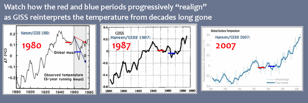
The accusers cite the image in the 1976 national geographic, which shows a large decline in temperature from the 1940s to the 1970s. The claim is that GISTEMP has erased much of the cooling seen in this 1976 national geographic imagine and even that Hansen has reduced the cooling over various versions of GISTEMP's history.
Below is the comparison image used which shows the red and blue lines drawn haphazardly on the images to convey a change in the data:
This is the original article
http://hidethedecline.eu/pages/posts/decline-temperature-decline-1940-78-the-cold-data-war-170.php
The accusations have then spread all over the skeptic blogs:
http://joannenova.com.au/2010/03/the-mystery-deepens-where-did-that-decline-go/
http://wattsupwiththat.com/2010/03/18/weather-balloon-data-backs-up-missing-decline-found-in-old-magazine/
And to less well known places:
http://wallstreetpit.com/20710-climategate-goes-back-to-1980
As usual though it's not the analyzers who make the strongest accusations, it's the blogs down the line who link to each other and heap on more and more libelous smears as they go. I even had one commenter on the Joannenova blog direct me here: http://hennessysview.com/2008/07/23/dr-james-hansen-of-giss-is-a-liar-and-a-fraud/. Through that descent into madness I may be getting close to the hideouts of the folks that send death threats to scientists.
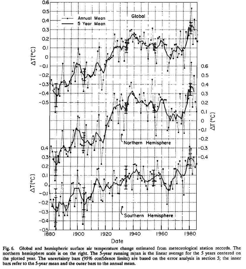
GISTEMP 1980
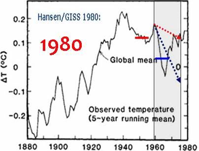
The underlying graph is derived from Hansen et al 1981 (PDF) although the hidethedecline.eu references the image in this NASA article. The paper doesn't really discuss the graph data much, I guess this is proto-GISTEMP. But the paper does strongly suggest that the graph is of meteorological stations. Ie no sea surface temperature input.
Hansen et al 1981 also shows the data for different latitude bands:
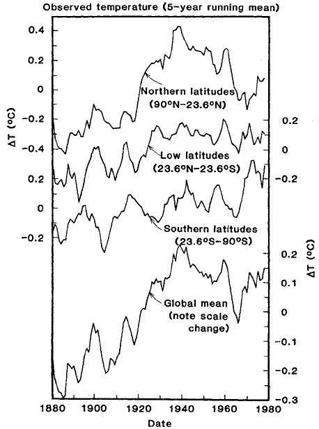
Suffice to say it's clear that the Northern latitudes exhibit a larger 1940s-1970s decline than the global record.
Hansen/GISS 1987
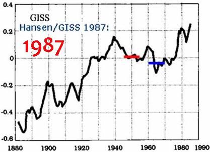
Not referenced. Hansen et al 1987 perhaps? The graphs in there don't quite match this one. Here are the graphs from Hansen et al 1987. These are for meteorological stations only:
Comparisons with modern GISTEMP
There is of course a difference between global GISTEMP using land from meteorological stations only, and global GISTEMP using meteorological stations plus sea surface temperature.
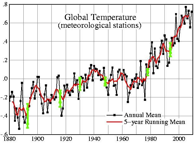

It is necessary to compare the old GISTEMP graphs with the right modern type. In this case the one using meteorological stations only.
Comparison of Hansen et al 1987 graph (blue overlay) with current global GISTEMP based on meteorological stations:
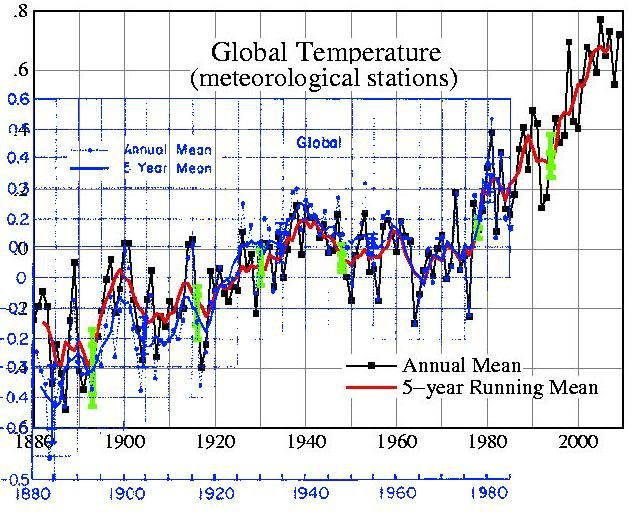
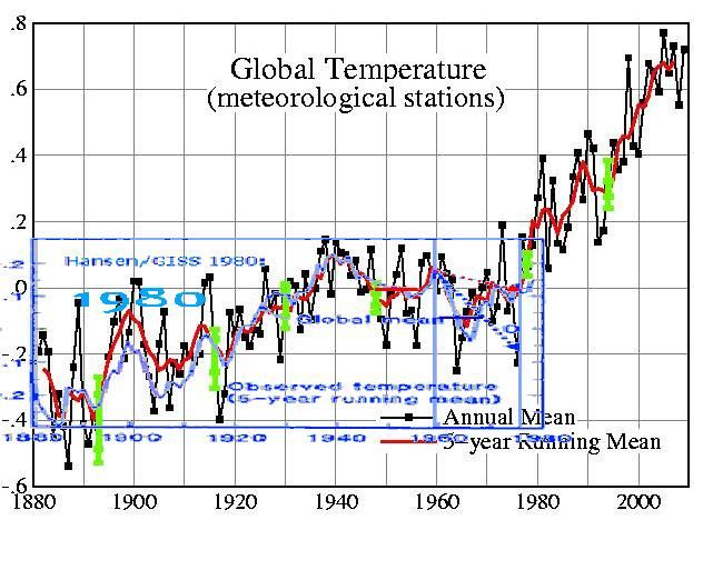
Comparison of Hansen et al 1981 graph (blue overlay) with current global GISTEMP based on meteorological stations:
This overlay stuff is all rough eyeball stuff, but there is little difference here o get worked up about. GISTEMP does not show any change in the period 1940-1970 over it's history that deviate from what can be expected from changes in the algorithm, input data, etc. It even coincidentally seems to be within the error bars anyway. Much fuss about nothing.
On the last image notice that the modern GISTEMP image shows a large rise starting just before 1980 while the 1981 image shows (up to 1979) flat. decline.eu says:
"not only did Hansen alter the trend 1940-75, he also made a HUGE adjustment around 1975-80, much more warming trend in 2007 compared to 1981."
This is incredibly unlikely. Just how could one scientist engineer in a HUGE adjustment like that without anyone else noticing? Let alone getting it to stick. How would he even do it? He cannot alter the underlying met station data afterall. Can you not think of better reasons for the difference? I notice for example that the 1980 graph is plotted with a 5 year running mean, so potentially that is the problem as the end points of the Hansen 1981 graph will be affected.
The 1976 National Geographic graph
This is where the real disagreement is. GISTEMP and HadCRUT disagree with the following National Geographic graph:
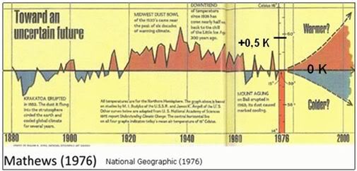
This graph uses data from Budyko 1969 (PDF) up to 1960. The final part past 1960 is produced from radiosonde data. It's the final bit involving the radiosonde data where the substantial disagreement with GISTEMP and CRU is (and raw GHCN...). While there is some disagreement between the Budyko data and the GISTEMP and HadCRUT data, I think that could be explained by the following.
The Budyko data is described in detail in Rockboc 1982 (PDF). The summary reads:
A Russian group under the initial leadership of M. I. Budyko, has produced the first analysis of monthly average surface temperatures for the North-ern Hemisphere on a 5x10 latitude-longitude grid. This data set and the magnetic tape of the data are described in this report. The Russian data set is the first and only available digitized, gridded collection of monthly average Northern Hemisphere surface temperature data. The quality of the data over land, especially for recent periods, should be excellent and useful for many studies of climate. The quality of the data over oceans is questionable, and, unfortunately, it will not be possible to objectively determine the quality by a reanalysis. I would recommend to some-one interested in data over the oceans, to either acquire data based on ship measurements (e.g., Pal-tridge and Woodruff, 1981) or wait for the analyses of the Climate Research Unit or GISS. These later analyses will be able to include an analysis of the quality of the data over the oceans, and the depen-dance of the results on the analysis technique used. I expect the analyses of the Russians over land to be very similar to those of these other two groups.
Note the concern about the ocean part of the analysis and the suggestion that GISTEMP and HadCRUT may provide more accuracy here. The paper also notes that
"few data were available for this period south of 20N and near the North Pole, so it was not really a hemispheric average."
Jones 1986 (PDF) mentions regarding the same Russian data:
"The Russians extrapolate their analyses over the ocean areas of the Northern Hemisphere, even though only isolated island data are available. This procedure is dubious and gives a false impression of the true data coverage."
That's plenty of reasons to think that the later analyses by CRU and GISS might find different results. I think it's important to look at papers published in the 70s and early 80s to figure out exactly when and why the changes occurred as scientists typically discuss differences between their results and the results of others. I was looking for Jones 1982 earlier which apparently reviews earlier Northern Hemisphere temperature analyses, but couldn't find a PDF.
To give a case in point as to why the above issues might affect the results, take HadCRUT and CRUTEM. Hidethedecline.eu has a post dedicated to the National geographic graph in which they compare HadCRUT3 Northern hemisphere with the national geographic graph.
http://hidethedecline.eu/pages/posts/temperature-corrections-of-the-northern-hemisphere-144.php
But if you use CRUTEM instead (land only), there is little disagreement through the Budyko data 1940-1960 (this overlay is y-aligned arbitrarily)
 So inclusion of ocean data would seem to make a big difference. If Budyko is strongly reliant on land data then this could explain the difference.
As mentioned earlier the national geographic graph uses radiosonde data after the Budyko data ends. That's where there the big difference is. I haven't looked into this yet. I was hoping to find Jones 1982 and possibly some earlier papers which may shine light on the subject.
The bottom line for me is - why drag GISTEMP and HadCRUT into this at all?
The raw station data is out there and available. If skeptics think the 1970s show more cooling than GISTEMP and HadCRUT show, then by all means demonstrate this using the raw station data.
Tamino has already looked at the raw station data and the result has been reproduced by others too.

http://tamino.wordpress.com/2010/03/05/global-update/
The 1940-1970 decline in the raw station data is not as pronounced as the national geographic article. It's absurd on the face of it to accuse GISTEMP and CRU of hiding a decline which doesn't show up in the underlying station data they use.
Tip: http://wattsupwiththat.com/2010/03/16/rewriting-the-decline/#comment-346527
ReplyDelete"In 5 minutes I found the source of the National Geographic plot.
The effect of solar radiation variations on the climate of the earth
princeton.edu
MI Budyko – Tellus, 1969 – aos.princeton.edu
Google “author:budyko temperature” to get the link to the PDF.
The original data is from 1969, though it looks like it has been updated in the NG plot. The data is from “a group of stations in Europe and America with the longest-period series of observations”, whereas HadCRUT is obviously more widespread data."
thanks for that. I am aware the post is very rough and incomplete, I spent all of sunday trying to figure this stuff out (and a lot of that time was spent copying images around...ahhh). And I was planning to work on GHCN instead...oh well. By the end of the day I just wanted to hit post and be done with it. I originally made the post more snarky but toned that down as I don't have all the facts.
ReplyDeleteIt seems to me the only big question left is why the post Budyko data in the NG plot (the radiosonde data) disagrees with the modern surface records.
This is a trick Wigley uses to get the data "right"
ReplyDelete"Here are some speculations on correcting SSTs to partly
explain the 1940s warming blip.
If you look at the attached plot you will see that the
land also shows the 1940s blip (as I'm sure you know).
So, if we could reduce the ocean blip by, say, 0.15 degC,
then this would be significant for the global mean -- but
we'd still have to explain the land blip.
I've chosen 0.15 here deliberately"
Maybe Hansen have similar methods
There's a known problem with he 1940s blip in regard to sea surface temperature data. He's speculating about the consequences of a hypothetically sized correction. You have to read the email that replies to him for more context.
ReplyDelete